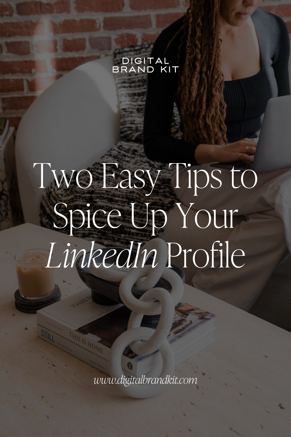
A few weeks ago, Hannah (our rockstar Head of Operations) and I updated our LinkedIn profiles with these colorful little banners.
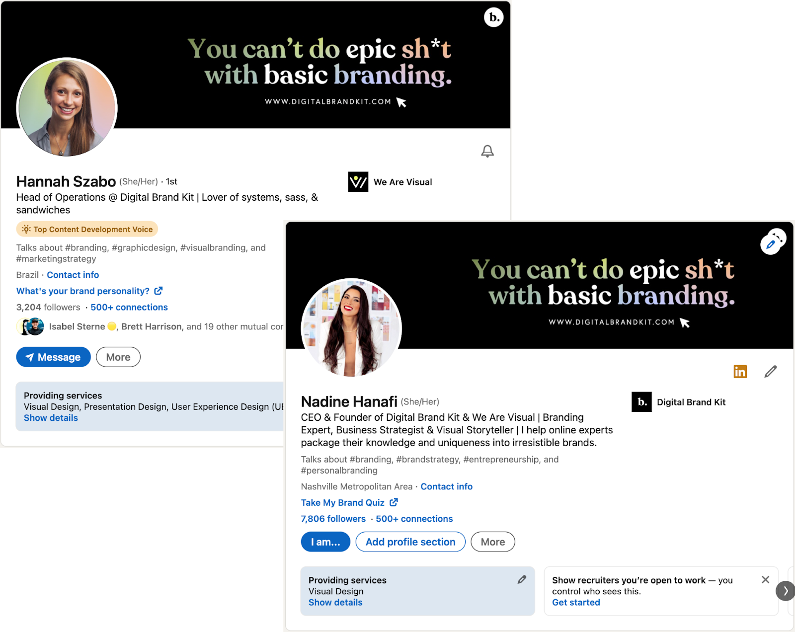
And you would not believe the number of messages we got from people commenting on the new banners. Especially Hannah! I mean, this woman has one of the most engaged LinkedIn communities I’ve ever seen! If you don’t already follow her, do it now! You’ll thank me later.
But I digress. The fact that we got so many messages about the new banners was flattering. It was also very insightful because it says two things:
- Even though LinkedIn is not a visual-first platform, your visuals matter.
- Because many people neglect their visual branding on LinkedIn, you have a massive opportunity to use visuals to really stand out.
Which leads me to today’s question.
To illustrate my response, I’m going to use two examples from our very own (and fabulous) DBK customers: Kristin Engen and Cherylanne Skolnicki.
Example 1
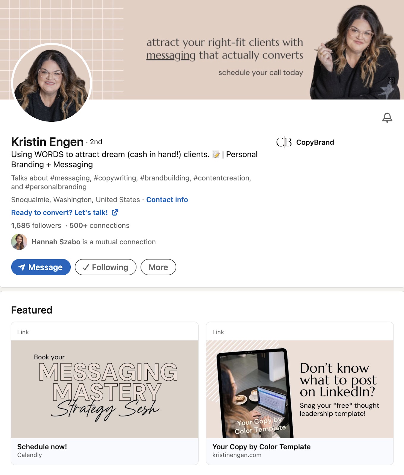
Kristin’s banner cleverly uses a photo of her to beautifully frame her tagline and call-to-action in the middle. Her banner is clean and minimalistic, letting her content shine. She also uses beautifully branded thumbnails in the featured content section to draw attention to her two main offers: an invitation to schedule a strategy session and an invitation to sign up for her free download.
Brilliant!
Takeaway: Make your LinkedIn profile stand out by adding eye-catching thumbnails to your featured content that direct people to your signature offer(s)!
(Psst! We actually created Kristin’s LinkedIn thumbnail graphics LIVE during our Monthly Office Hours session yesterday. You can find the link to watch the replay at the bottom of this article.)
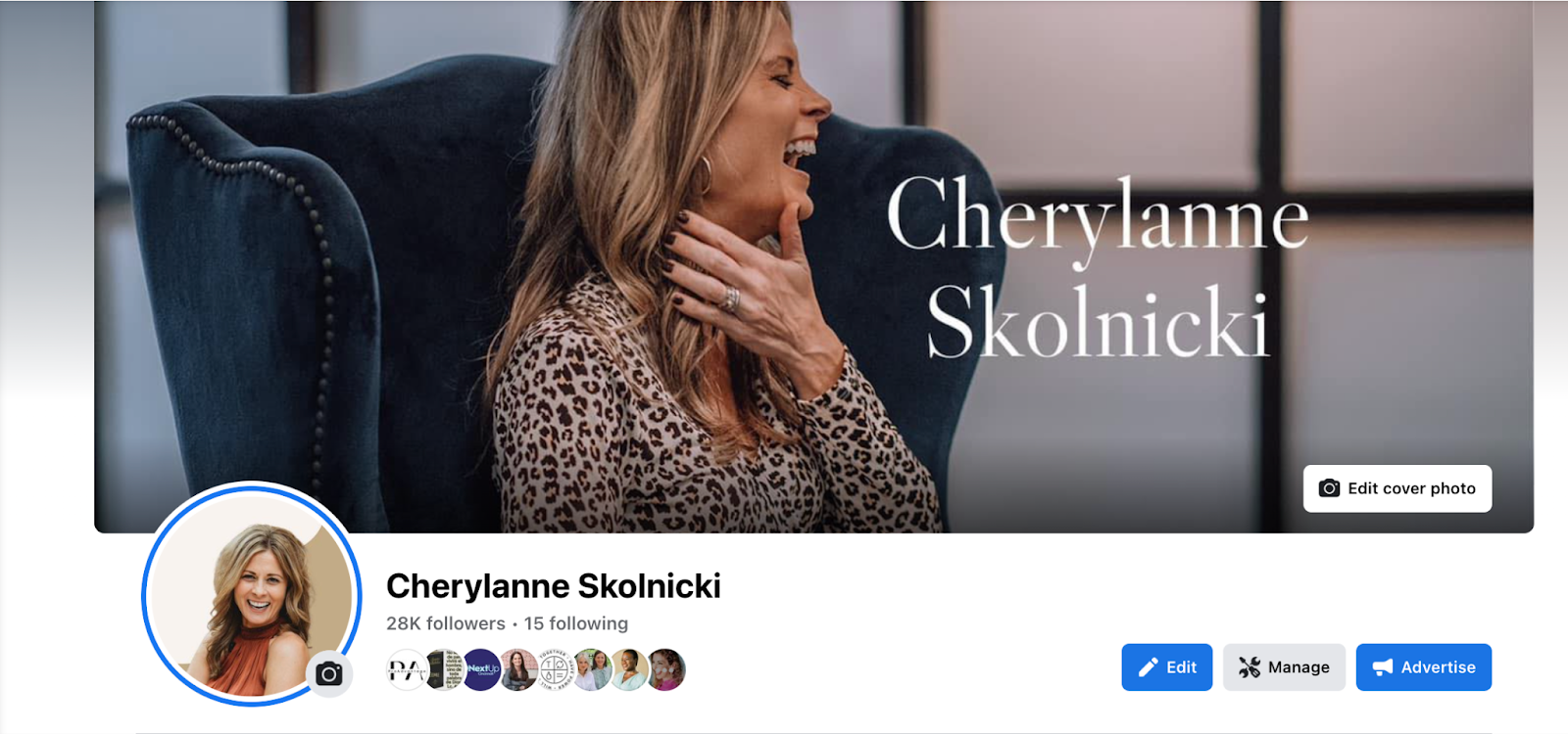
Example 2
Do you think Cherylanne’s perfectly curated banner was a creative miracle? Nope! She used her DBK template to create this stunning LinkedIn banner for her profile.
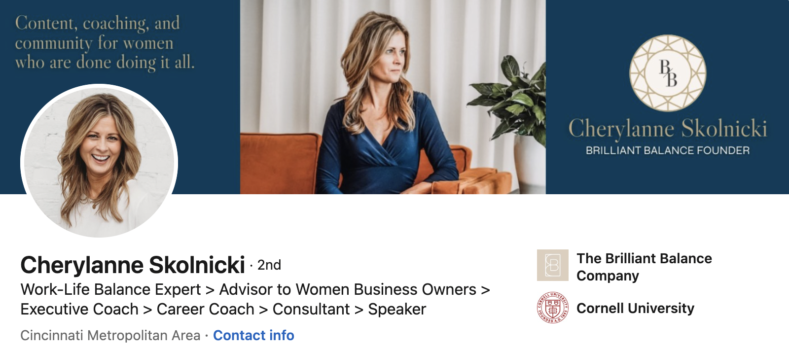
This particular template divides the full banner into 3 sections which allows you to fit more content into this small space without making it look crowded. And notice how her eyes are looking at her logo. She’s subliminally signaling you to direct your attention to her logo too. Coincidence? Yeah, no. The visual system wants what the visual system wants.
Takeaway: Divide your banner into 3 sections and add your logo on one side, your tagline on the other, and a captivating image in the middle.
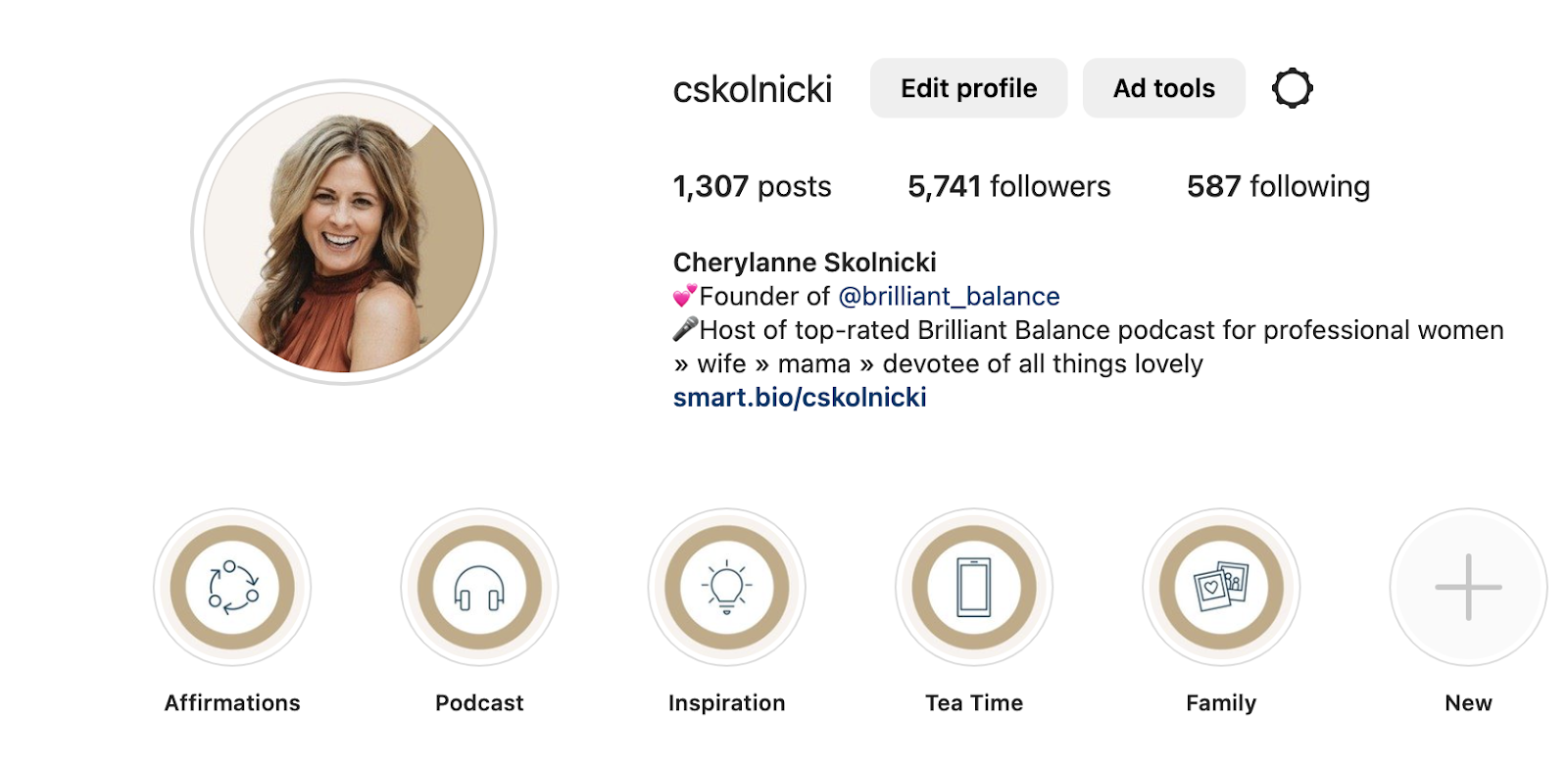
And notice how Cherylanne used her DBK templates to create matching branded assets for her Facebook Group page and her Instagram! That’s how you create brand consistency across platforms!